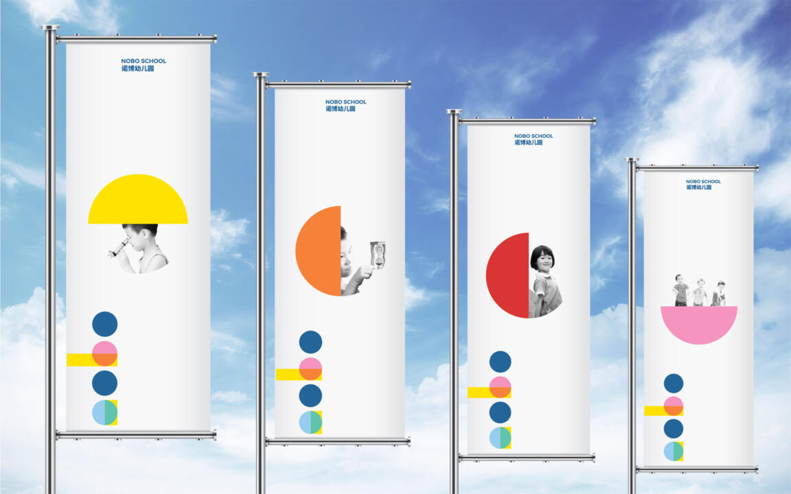
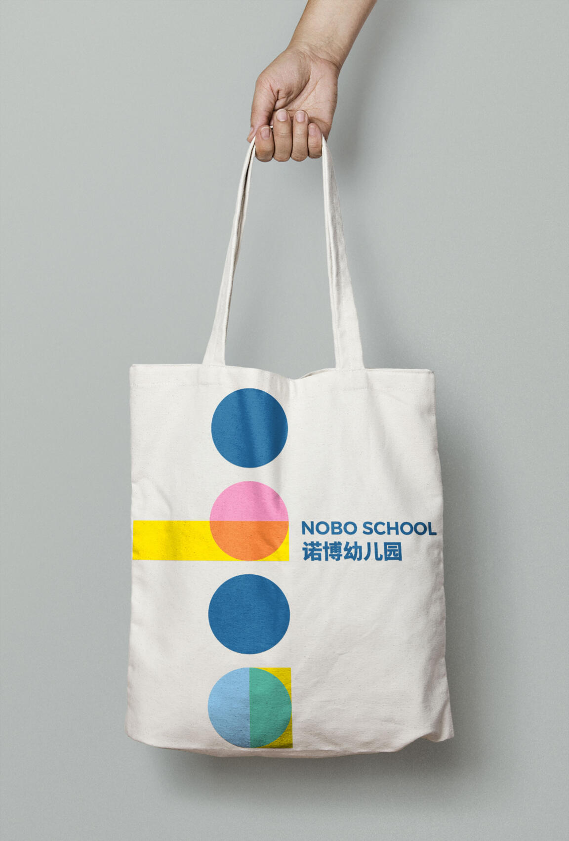
The NOBO school logo expresses a playful approach to the effect of learning on each individual. Using the name “NOBO”, each element has its own character. The yellow bars stand for education and, when they overlay the other colours, they transform them forever.
The NOBO school brand is a reflection of its educational ethos. It builds on the individual and its many colours and, like an artist’s collage with its many layers, it relates to the endeavour of a child’s education. The brand is represented not only by its visual identity (logo, colours, type and graphics) but also by the people that carry the brand (teachers, students, and families). Using the right elements and tone is essential for brand recognition and to express a single voice everywhere we go.
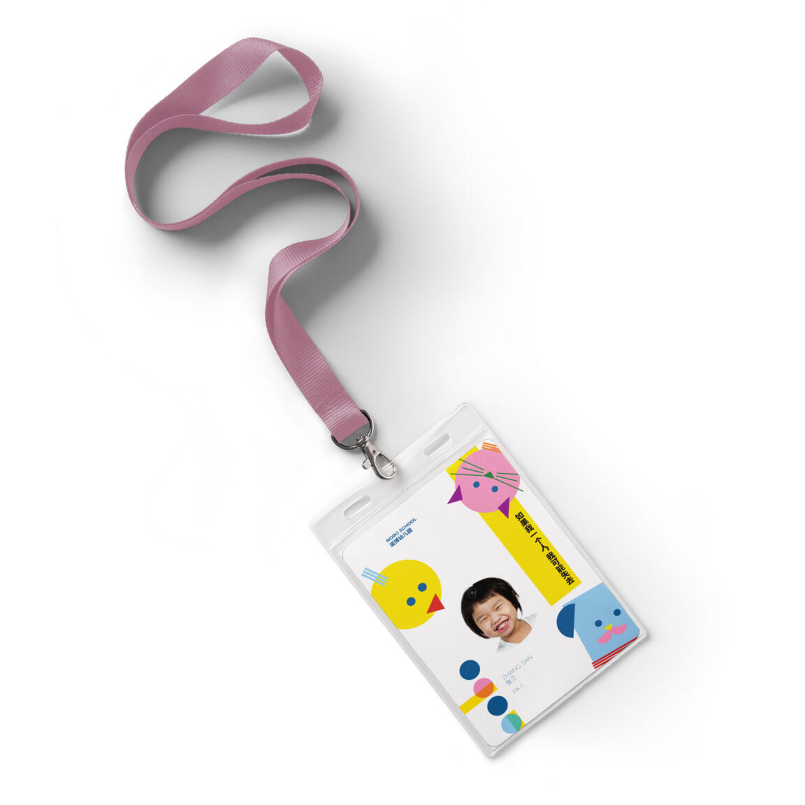
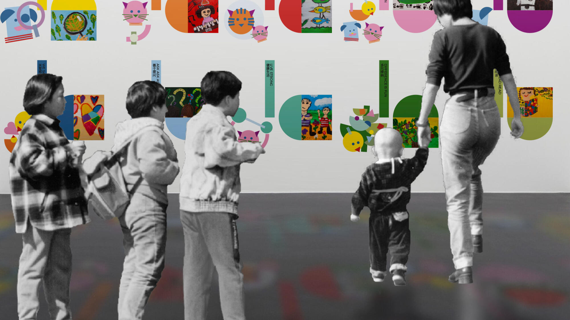
In order to represent the school best to whom it matters most, the children, three characters have been developed: Hugo, Eva and Joy. Their role is to relate the school’s core values to the children by having them part of their personalities. Like that they become inseparable of NOBO’s image and are to be treated as an extension of the logo material. The school’s three mascots are born from the need to better relate the school’s core values, the 10 key habits, to the children, as personality traits are easier to grasp than abstract concepts. The choice of their names is not arbitrary and refers to their specific individuality.